Chart of the Day – US Greenhouse Gas Emissions Inventory
A few thoughts and some data as context for President Obama’s much touted “historic” agreement with China on greenhouse gas emissions.
Keep in mind that the agreement is voluntary, bi-lateral, and prospective.
China did not commit to any reductions, just to slow the growth and cap emissions sometime around 2030.
China also promised to meet a 20% renewable energy goal, but keep in mind that China’s largest source of renewable energy is giant destructive hydropower dam projects.
The agreement comes at a critical point in the run-up to the Paris negotiations. As such, the Obama deal takes the focus off and actually undermines efforts to secure a mandatory, binding, multi-lateral global treaty with real and deep reductions.
According to Obama, the US “commitments” are alleged to be from 26 – 28% by 2025, based on 2005 base year emissions.
Due to the economic recession, fuel switching from coal to natural gas, and structural changes in the US economy from manufacturing to services, the US is more than half way to that goal, so the “commitment” is far less than advertised. (we exported those emissions to China as the USA de-industrialized. In fact, about 1/3 of China’s emissions are the result of manufacturing goods for export to the US! )
The rest of the world uses a 1990 emissions base year. Emissions have grown considerably since 1990.
When the 1990 base year is used, the US commitment is tiny, around 6 -8%.
To put the US “commitments” in context, consider the fact that scientists tell us we need to make deep (80%) reductions in the next few decades, on the order of 8% PER YEAR, to avoid irreversible and potentially catastrophic runaway climate change.
After this pittance, why would any country agree to do more than the US, the world’s richest country and by far the world’s largest historical emission source?
The Obama deal virtually guarantees that we exceed 2 degrees warming and blow through critical tipping points.
That sheds a whole new light on “historic”, eh?
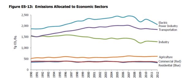
Here is the US emissions inventory – oh, and it doesn’t include emissions from the huge US military sector or from huge US imports.
Inventory of U.S. Greenhouse Gas Emissions and Sinks: 1990–2012
Using this categorization, emissions from electricity generation accounted for the largest portion (32 percent) of U.S. greenhouse gas emissions in 2012. Transportation activities, in aggregate, accounted for the second largest portion (28 percent), while emissions from industry accounted for the third largest portion (20 percent) of U.S. greenhouse gas emissions in 2012. In contrast to electricity generation and transportation, emissions from industry have in general declined over the past decade. The long-term decline in these emissions has been due to structural changes in the U.S. economy (i.e., shifts from a manufacturing-based to a service-based economy), fuel switching, and energy efficiency improvements. The remaining 21 percent of U.S. greenhouse gas emissions were contributed by, in order of importance, the agriculture, commercial, and residential sectors, plus emissions from U.S. Territories. Activities related to agriculture accounted for 9 percent of U.S. emissions; unlike other economic sectors, agricultural sector emissions were dominated by N2O emissions from agricultural soil management and CH4 emissions from enteric fermentation. The commercial and residential sectors each accounted for 5 percent of emissions and U.S. Territories accounted for 1 percent of emissions; emissions from these sectors primarily consisted of CO2 emissions from fossil fuel combustion. CO2 was also emitted and sequestered by a variety of activities related to forest management practices, tree planting in urban areas, the management of agricultural soils, and landfilling of yard trimmings.
